Good instructions do more than describe; they show. In service manuals, assembly guides, and work instructions, a well-chosen visual can prevent a wrong turn, highlight a hidden fastener, or make a safety boundary unmistakable. Yet many teams still default to long paragraphs or generic screenshots that leave technicians guessing. The key is selecting the illustration type that fits the specific task, the viewing environment, and the reader’s time pressure. This article outlines concrete choices that help visuals carry the right load, from orientation to safety. As a result, your procedures are faster to follow, easier to translate, and less prone to error.
Procedures That Work Better With Diagrams Than Paragraphs
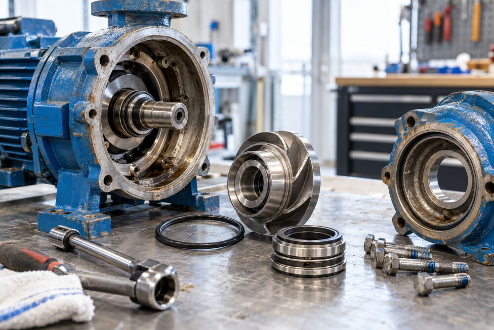
Some tasks consistently benefit from purpose-built visuals: steps with tight spatial relationships, sequences that repeat across similar models, and procedures where orientation errors are costly. Consider a field technician replacing a cartridge seal in a centrifugal pump inside a cramped enclosure. An exploded view diagram with numbered callouts and a rotation arrow clarifies the removal order better than any paragraph. Teams often turn to technical writing and illustration services when these high-friction steps pile up, because a targeted diagram can make torque values, gasket alignment, and safety clearances unambiguous at a glance. The payoff is fewer stripped threads, fewer leaks at startup, and less back-and-forth with support.
Pick the Illustration Type That Fits the Task
Different procedures call for different visuals. Exploded views help with parts order and fastener identification, while cutaways reveal internal passages or seal stacks you cannot see assembled. Step-by-step sequences with consistent viewpoints are ideal for disassembly and reassembly, especially when paired with per-step torque specs and tool icons. Wiring diagrams or harness layouts beat photos any day when wire colors, connector keys, and pinouts matter. Schematics are best for function and flow, such as hydraulic or pneumatic circuits, because they abstract away hardware shape and emphasize relationships like pressure, direction, and control logic.
Every choice comes with trade-offs. Photos communicate surface finish and real-world context but introduce shadows, glare, and background clutter that obscure small features. Vector line art offers crisp edges, easy scaling, and clean layering for callouts. Still, it requires disciplined simplification: hide irrelevant fasteners, remove hidden edges that confuse depth, and crop to a single viewpoint. A common mistake is pasting a raw CAD screenshot with all hardware visible; it overwhelms the eye and invites misinterpretation. If you use color to differentiate parts, ensure the same message survives in grayscale printouts by varying line weight, hatching, or patterns.
Prepare Usable Source Material Before You Draw
Illustrations are only as clear as the inputs. Start with clean CAD assemblies when available, with suppressed hardware not touched in the procedure and meaningful component names mapped to the BOM. If CAD is unavailable, shoot reference photos that lock the viewpoint and include a scale cue, then trace into vector art. Interview subject matter experts to capture hidden details like preload direction, seal lip orientation, or thread treatment. Align on nomenclature early: part numbers, fastener grades, and tool names must match what appears on the cart and in the parts catalog. Set constraints up front, such as maximum graphic dimensions on a mobile device, minimum line weight for laser printing, and whether localization will favor numbered callouts with a legend over in-graphic text.
Design Choices That Survive the Shop Floor
Illustrations must work in gloves, under poor lighting, and sometimes on a dusty tablet. Favor high-contrast line work, minimal perspective distortion, and uncluttered backgrounds. Standardize callouts so numbers never occlude edges; use leader lines that terminate at clear attachment points, not general regions. Keep torque specs and clearances close to the relevant fastener with a consistent unit convention, and add a small wrench or hex bit icon when tool choice matters. When safety is in play, draw hazard zones explicitly: a shaded crush area, an arrowed pinch point, or a no-step-decking marker. Pair visuals with recognizable symbols from ANSI or ISO libraries so PPE and lockout steps are unmistakable even before a word is read.
Test under realistic conditions. Hand a draft page to a technician tasked with loosening a tensioner on a rooftop air handler. If they rotate the wrong pulley or miss a hidden set screw, the issue is likely viewpoint or callout placement, not their skill. Adjust the camera angle or redraw the line art to match the posture and line of sight they actually have at the machine. If prints will be laminated, check that fine hatching stays visible behind plastic glare. If instructions live on tablets, confirm that tap targets for zoom and cross references are finger friendly and that colors hold up on night mode.
Keep Illustrations in Sync With Engineering Changes
The only thing worse than a confusing diagram is a wrong one. Tie every graphic to a revision-controlled source and display its version ID where the reader can see it. When an engineering change order updates a bracket or inverts a connector key, trigger a redraw and note visible change bars or a delta symbol so returning users spot differences quickly. Use modular artwork: a reusable subassembly, such as a valve stack, becomes a single maintained component placed into multiple procedures. Store master files in editable vector formats like SVG or EPS, export production assets to PDF or PNG based on the delivery channel, and attach searchable metadata so automated publishing systems can pull the right image per model. For accessibility and search, add alt text that states the functional point of the visual, not just its filename. If your documents go global, prefer numbered callouts with localized legends, and avoid embedding untranslated text inside the art.
Every minute a technician spends decoding a picture is a minute not spent fixing, assembling, or verifying. Choosing the right illustration type, preparing precise inputs, and designing for shop-floor realities turn visuals into working tools, not decoration. The payoff shows up in fewer support calls, faster training, and safer work. Start small with a high-impact procedure, measure where technicians hesitate, and refine the visuals until the hesitation disappears. Then apply the same standards to the rest of your library so the next time a bolt head hides under a bracket or a wire color repeats across harnesses, the drawing tells the truth at a glance.